

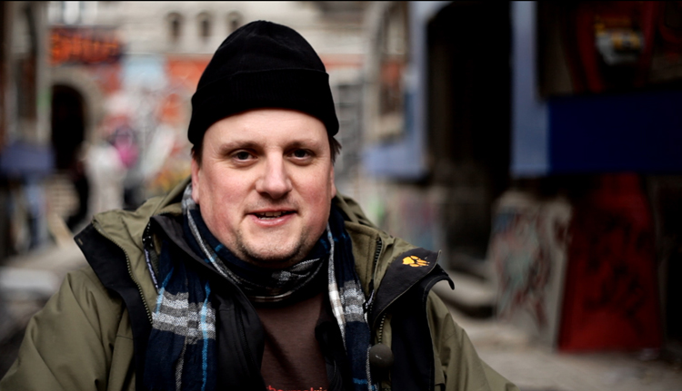
David Warren – the Production Designer for Terry Gilliam’s The Zero Theorem, spoke with Dreams in November 2012, in Bucharest during the shoot. At the end of the interview, he said, “[Terry’s] still got to do postproduction – and my phone will be off!”
Unfortunately for him, David left his phone on and was soon back working full-time on the project in postproduction. He spoke with Dreams again in May 2013 when post was still ongoing.
Phil Stubbs: You are currently heavily involved with the postproduction. Is that typical for a production designer?
David Warren: I don’t think it is typical, but it may be becoming more typical. I think historically a lot of production designers have had a hovering involvement in post in a similar way the director of photography used to do. I was talking with a few other designers who said they sit in on grading, so they’ll come back to look at stuff and sign off on design notes for visual effects and things like that. It depends very much on availability.
I just think at the end shooting, Terry was keen to keep me on. He made a conscious decision, because environments were designed only to a certain level in preproduction, to establish what the sets look like. But then there is what you might call visual effects art direction – filling in all the gaps, for example what does the set look like when you look back? Terry made a valid point, asking who was going to do that in post? If we put that on the shoulders of effects vendors, they would say, well we haven’t even seen a concept piece for that. So I hung around – it was the same deal on Parnassus.
On this one it’s been much more full time. I have been going into editing every day, issuing notes. Terry looks at shots, he makes all sorts of creative notes to the vendor and it’s important to format that in a recognisable way. You do that by Photoshopping on top of a film frame and getting it back to the vendor, saying we think it needs to be slightly darker here, or we need more light coming in here.
So you have provided a consistency to the look of the project
It’s strange. Terry is more consultative than you might think. He throws things out there. He asks: what do you think of this shot, what do other people think? He’s actually much less dictatorial than you’d think. And if he wants to come down on one side or the other, he’ll say I’m overruling that, this is what I want. We all respect that, that’s what a director’s supposed to do. But he does value what input people put into it.
His consultative nature is most visible with the actors
He likes what people bring to the table, especially with the actors. It’s interesting, for a guy who is into so many details on set about all the physicality of how the film is made. Especially I would say with the art department, visual effects, wardrobe, hair and make-up, the things that are tangible on the set. He does transcend all the various levels of filmmaking, I think that’s always been the way with him. I think he’s got a very good way with everybody on the crew.
With this project, which of Terry’s references have you found most useful?
The reference he gave me at the beginning was a German artist called Neo Rauch. I remember getting an email from him saying, “Neo Rauch plus Ukelele Ike = Zero Theorem“. Ukelele Ike was the guy who sang When You Wish Upon a Star; he was Jiminy Cricket.
This script has come out of left field. Everybody who has seen the movie now really feels quite strongly that that’s its strength. This one has a low budget, and we were talking about it today actually, all those things actually play to its strengths. Although there is a certain Gilliamesqueness in the script, it doesn’t lend itself to the last few projects that Terry has done. It’s an incredibly esoteric strange story, and he has injected all his normal Terry tropes into it.
When we were on Parnassus, he was looking at Grant Wood and Odd Nerdrum, but at the beginning of The Zero Theorem he got Neo Rauch, and I don’t think there is any of it in the film at all in the end. It was pinned up on the walls of the art department, and every time he used to come in, he said, well you can get Neo Rauch in! I said, “I’m trying really hard mate, I just can’t do it!”
With respect to the look of the film, there were some keynote moments, where things that have set the whole look were decided, and they were incredibly strong decisions. I think one of the things he was very afraid of was this film being compared with Brazil. He was very worried about that. We both wanted to make a strong reaction against the conventional future dystopian society. There’s a lot of science fiction out at the moment which is elegant, beautifully designed, uber-futurism, very linear, concrete, steel, lots of glass, and monochromatic.
And Terry just riled against it, he said that we’re going the other way: the future that I want is going to be inventive in terms of colour. A mate of mine came to a screening a while ago, he came up with “Bubblegum Dystopia”, and I think that stuck, because the film contains pinks, oranges and candy apple colours. Qohen himself is the only monochromatic thing in the whole city. That’s how he stands out – he’s like a little black silhouette, in the city. Light falls into him, like the black hole.
Qohen is this little shadow of darkness, this little boring blot, especially in the ManCom offices, when I see it I think it looks like the inside of a Lego factory. Everything is like yellow, primary colours, the computers are all working at. It’s like when you open the lid on a box of poster paint.
At the start of preproduction, I was on holiday and Terry had already started work on it. Selecting locations within Bucharest early on, looking at the city via Google. He had already found some interesting streets, and a lot of stuff sent from Bucharest, he forwarded to me. The main locations were sorted very early. And those really were Terry’s ideas.
One of the things you can never really get in front of, with Terry, is in the script, its translation and the stage direction, in terms of what he thinks we can do with what is written. I kind of have a handle on what’s coming, and Nicola knows.
It was interesting when we got out there. The rest of the production was baffled about why we would want to shoot the mainframe computer in a steel mill? I remember this location they had found, in Calarasi. It’s two hours out of Bucharest. We didn’t shoot there in the end, but when we went there to have a look, it was an extraordinary derelict landscape, massive concrete pillars with nothing on top of them, weeds growing. In the middle of it is this thing that looks like a massive steel mill blast furnace. He said, “What about that for the computer?” But not in anybody’s wildest dreams would anyone have picked that up.
Have you seen the doctor’s surgery? In the script it is “INT Doctors’ Consultation Room”. You could do anything, you could use a small white room. We started by talking about that, but there is nothing he will write off, there is nothing that Terry will not consider for this. A high energy physics laboratory with the great big copper balls was suggested, and he said yes that’s it, that’s the one. It’s one of the best things in the film, it’s just a striking image, that high wide shot of it. If you watch that, you’d think that half of that is CG, or that thing doesn’t exist, but yes it bloody does exist. He gets a lot of personal enjoyment from establishing that stuff early on and some things I discuss with him and I took care of, yet there are other things that he’s already come down on that side.
On this project, the budget constraints were severe. But running between those rails, the shackles fell away. We thought: well, we’ll do the most extreme thing we can think of.
He sent me a Photoshop of the chapel location while I was on holiday in France. He said, that’s my chapel. You don’t get that from any other director!
Did the beach require any set dressing, or were you just shooting on sand with effects added later?
I don’t know how I would do it again, but because of the constraints of the action, and our schedule, I don’t think there was ever the question that we could go to a real beach. The idea was that we used the fact that it’s going to be a digital extension to our advantage. There was a watertank at MediaPro that we had to do a lot of preparation work on, that’s where we shot it.
I saw the watertank just a few days before you shot there, and there was just nothing there, just a rancid pool of water with a bit of sand on the side!
Yep! All we did really was a concrete ramp going down to the waterline which we extended. We did the water dressing which was the seaweed and the flowers. It was a big ramp of washed sand. We made a load of big polystyrene rocks which were sort of referenced the Seychelles and Lake Tahoe. And they would provide physical interruption between the set and the blue screen so at least there was a form there. It was a pretty definite matte line.
It was the best solution with the resources that we had. I think the beach has gone through a massive design revision since then, and it is still evolving. It’s come a hell of a long way. We’ve referenced it quite strongly to the landscape of St Lucia, with the Piton Mountains that come down to the sea. There’s an incredibly vibrant orange and pink sky, it’s like a fantasy South Pacific poster from the 1950s, super-saturated. Although we were making it as real as we possibly can, there will be an edge to the CG which obviously says you are not in a real landscape, which the audience will know because it’s all done through a bio-telemetric interfacing suit!
It is a fake environment. It is too perfect, the sun never sets. The clouds are frozen: an incredibly pristine lurid Technicolor environment.
Did any of the design of the beach happen before the shoot?
Very little actually. We were very up to our necks with the major set build. The set was a choice of rocks and a choice of sand. It snowballed before the end of the schedule because Terry was looking at the Seychelles references and then we were looking at Lake Tahoe references where the rocks are much softer and rounder and slightly more surreal looking. We did have those discussions and I think we did have two visuals of it, one looking into the sun and one looking into the jungle. Terry just said, put the rocks there and there and there.
But then suddenly it was January. We had all had the break, Terry called and said, “Can you come back on? Right… the beach… what is it really going to look like?”
And the black hole – what does that look like?
At the moment, there are certain things that the black hole needs to do, and it has to do right from the beginning. It needs to feel like it is sucking, needs to be incredibly frightening and ominous. It does have a cosmological texture to it. You will recognise things around it like nebulae and stars from space. But at the end of the day, if you go on the internet now and look at a picture of what a black hole is, it’s not like a cosmological whirlpool in space with a vortex and a tunnel that light can’t escape from… that is an old view of what they look like.
But that is what we needed – you really need to feel that there is a Hoover in space sucking everything: life, energy, light… because it needs to feel ominous. There are so many textures in it. It was a very difficult one to get right. In fact we probably haven’t signed it off at the moment, but it’s incredibly close. My best analogy is like it’s a water whirlpool in a cosmological environment. Clouds, nebulae and particles of light are all being dragged into it. But it definitely feels like it is a vortex leading into a black pit. We never put realist boundaries on it ourselves in terms of it looking what The Sky at Night says a black hole is. It’s something in Qohen’s imagination.
The black hole is symbolic, something from which you can’t escape, that you are sucked into. It’s an analogy for nothingness itself, it’s what Qohen is most frightened of, being sucked into nothingness. It fulfils that, it’s been a very difficult thing to balance because you always end up, when you’re designing too hard, with things that are too beautiful, and Terry always said that it needs to look awesome and frightening, if not ugly. It’s a place you really don’t want to go, and that was a hard bridge to cross. As soon as you start placing these beautiful Hubble space telescope textures, you’ve got this severe risk of actually wanting to look at it, such a wonderful thing. But it must represent death and nothingness.
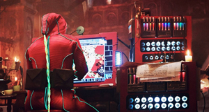
The entity-crunching and mathematical modelling we see on-screen. What role did you play with that?
Only at the very beginning. Technology is moving faster than we can even imagine. Certain science fiction films go along the line of holographic screen and God knows what else. I can remember CRT monitors not that long ago, and now you can’t find one; everybody is using flat screens. It’s just the march of technology. Now quite early on we came out with the idea of liquid memory, being suspended in some kind of fluid, and that’s your drive. It’s quite an arcane, messy kind of thing – downloading and uploading these tubes of fluid. You put them in a receptacle and out comes the information.
Terry made a conscious decision to use flat screens, he didn’t want to go down the Brazil route of all those CRT monitors with lenses in them. We turned everything portrait, we thought that would be quite interesting, like pages of a book, that was a conscious decision.
Terry was incredibly specific on designing a logic keyboard that wasn’t QWERTY. He wanted something completely different, the way you operate it with your thumbs, which you see everybody doing every day on their smartphone. He wanted mechanical buttons and funny bits and pieces on it and to make it a little bit different. So after much exhaustion we did build the keyboard – that was a real concept piece. I hope it holds up – a weird little thing like a Gameboy. In fact, that’s what investment bankers do, they play games.
For the entity crunching, Terry came up with the idea that he wanted The Zero Theorem to look like a landscape. We found a reference on the web early on, these things called Menger cubes. It’s like a fractal cubic environment. These cubes are like mathematical expressions and they have a very certain look to them. It was an image that we liked. We did some Photoshops and expanded and extended it. That was the reference that we handed over to the animators.
The logic of this world is this massive fractal landscape, made out of conventional six-sided cubes. And these cubes are like a form of packaging information, of the entities. Something that relates to, on a very basic level, what ManCom is doing. The cube prevails in the software, that’s what they are doing… it is forming a lifestyle out of entities, which are us, people basically. You are grabbing all these various entities, putting them together in this six-sided box, and that is an expression of a successful lifestyle. So it is a way of marketing and monitoring population, the consumer society.
So we never see a conventional mathematical equation?
You do actually – we found with this landscape, and with these cubes, that you really need to feel that there is task and success. It was very difficult to do that with pure geometric forms. You need something there that tags you. I think the idea was then when you see Qohen in Zero Theorem mode, he is still grabbing entities, although now these entities are cubes, buzzing around like bees in this environment. He’s picking them, collating them to form normal six sided cubes but that’s like packets of high programmed data. And then once you form a cube, the result is that the cube exhibits what it is carrying, it gives you a little piece of algebra, it gives you the function. You scuttle around this landscape trying to find the place it goes in. And you start to build an architectural model of what the Zero Theorem is. This algebra runs across its faces. Though, if it was a real job, you’d top yourself!
Flying through this landscape, it reminds me of fractal images from twenty years ago. White cubes covered in texture, greebles, random bits flying all over the place. In some areas it is uniform and beautifully finished, and that is what is what he is tending to do, like an architectural model, or a landscape model.
It’s supposed to be perfectly formed, hued 90 degree angles. He gets frustrated because every time he gets one bit right, it crumbles behind him and it all falls apart. Which is when he vents his frustration on his home computer.
Look forward to it… it won’t be like anything you’ve seen before that Terry has done!